Photography started out as a monochrome process largely on account of the chemistry available at the time. The first photographic colour prints were only produced towards the end of the 19th century and colour remained an experimental, specialist process for many years. Throughout the first half of the 20th century the majority of photos were printed in black and white but by the 1970s colour had become cheaper to process and print than b&w.
Black and white photography did not then die away or disappear with the advance of colour, rather it retained its appeal and maintained its own niche as a fine art or photojournalistic medium. And since colour development and printing with film is more complex than black and white, b&w photography has usually been considered more accessible to the amateur who can retain control of each step from first exposure to final print.
A colour photo contains a great deal of the same information that we take for granted in our everyday lives. No great leap of faith is required to understand a straightforward colour snapshot, and the ‘suspension of disbelief’ (a print, after all is no more than a flat sheet of paper) is almost automatic. Advertising depends on colour photography for its impact enticing us to spend on colourful items such as food and clothes, while black and white advertising images tend to be used for more subtle or abstract aspirations.
The earliest printing techniques, (woodblock, etching, etc) were invariably monochrome, again largely for technical reasons. You could say that scratching a map in the sand (possibly the earliest use of graphics) or sketching a hunting scene on a cave wall didn't require an elaborate colour palette; after all in the dim light of a cave using colour might seem rather pointless given that our night vision is monochromatic. But contrasting colours were used for effect seemingly as soon as painters became able to create the pigments.
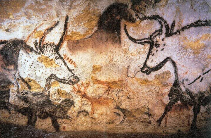
Black and red ochre can be found in cave paintings from 20,000 years ago, but technological discoveries rapidly led to the use of blues and a myriad of compound colours that have remained in use for over four thousand years. Cost might have placed a limitation on the use of a few particular colours, but economics is unlikely to have been the only reason for anyone choosing to make a monochrome rather than a polychrome image.
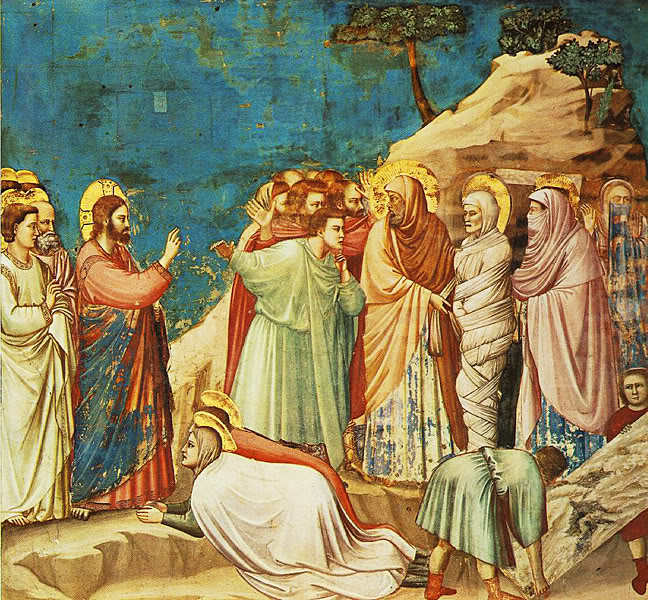
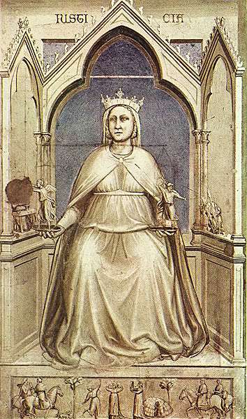
For example, in the 14th century both monochrome and coloured frescos were used in the Scrovegni Chapel in Padua, a design choice that may have been intended to emphasise the narrative themes of the coloured panels. Or, since they were along the lower section of the wall, monochrome was perhaps used to suggest carved stone supports to the panels above.
Whatever the reason for such choices, monochromatic and polychromatic images have lived side by side for a long time and seem to have their own distinct values. A possible explanation for this is that looking at a black and white image is never simply a visual experience alone - we perceive the difference at an intellectual and emotional level as well. We may actually be forced to, in much the same way that a cross-processed colour photo forces us to reconsider the norms of colour association.
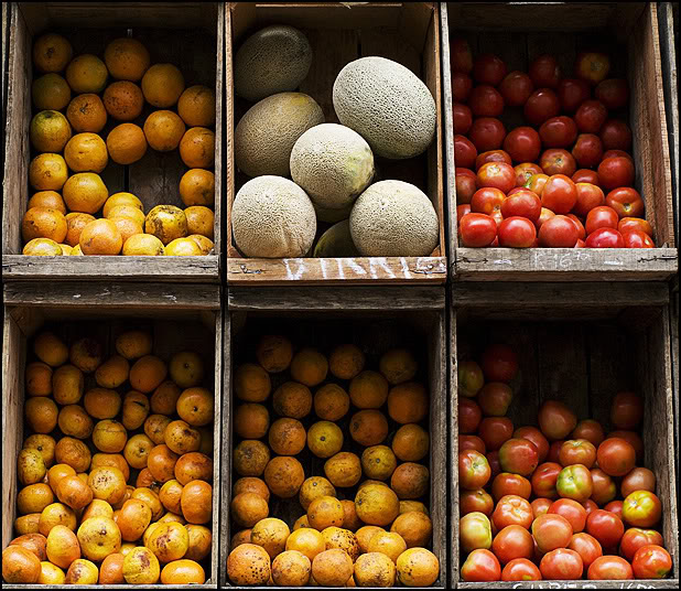
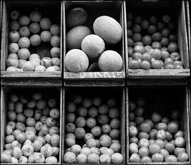
Apples are either green, or red, or a mixture of both colours. A colour photo that includes a bowl of apples can instantly suggest to us which are, say, Granny Smiths and which are Cox's, and we may even find ourselves involuntarily identifying each fruit. The type and tastiness of the apples is less likely to be at the forefront of our minds when presented with a black and white image of the same bowl of fruit. Visually, the first thing of note is likely to be their size and shape as a group and the relationship between the fruit and other objects in the image.
We might then notice individual differences, and here an interesting thing happens. Certain shades of red and green convert to the same tone of grey, such that whatever the mix of apple types or skin colours they may all look identical in b&w and the only difference we are likely to notice are differences of form.


Having said that, real apples are unlikely to have exactly the same tones of grey and even a small percentage difference is very noticeable. All the same, the strongest colour contrasts, like red and green, can disappear in a black and white image, leaving only the modelling of the object and its sculptural shape as defined by the light source. Light and shadow become predominant forces in the composition and the important contrasts are tonal.
You'll notice that in the b&w version of the shot below the tomatoes can be distinguished from the clementines by shape, texture and the reflective surface of the skins, even though Photoshop's Eye Dropper Tool can pick out equal greys among the two types of fruit. Indeed, texture and surface are emphasised as much as overall shape in the black and white version, again a direct consequence of how the light happens to fall on the subject.
It's sometimes suggested that a good colour image will make a good black and white image if the colour information is removed. There are many elements in the make-up of a good colour image, but interesting colour contrasts must surely be one of them. However, if the brightly contrasting greens and reds of the apple bowl are reduced to a uniform grey, one significant value of the colour image would seem to disappear. Advice like, "... the best starting point for a top-quality digital black-and-white picture is the well-composed, well-exposed RAW image file, with all its color information intact"1 is at best misleading.
A good black and white image is more likely to be defined by lines and planes of contrasting tone. Tonal differences help to emphasise form and the relative importance of differently shaped elements in the composition. This requires an element of 'seeing' in black and white, as much for the viewer as for the photographer, though the photographer also needs to develop an eye for strong forms.
This is echoed by many photographers in forums across the web who write that it’s very difficult to shoot a successful b&w image if they are not thinking in black and white. Post-processing software doesn’t make that challenge any easier either, since a successful colour shot may prove very muddy when converted.
There is, I think, a quality of visual literacy that comes into play with black and white images that is different to our response to straight colour photography. Precisely what that is, I don't know, but it may involve an awareness of, or sensitivity to form and shape that operates in a different way to the common and casual reaction to colour. We may need to look more closely to interpret the details of the scene just as we have to look more carefully when walking around at night. Or perhaps the fiction of the photograph becomes more persuasive as we move further away from direct representation. As Steve Fell so neatly puts it, "You look at a colour image, but read a black & white one."
In the image below (shot on black and white film) there may be many interesting varieties of fruit and vegetables but it is the overall pattern of their arrangement that matters. The grid of wooden boxes presents a contrast to the jagged lines in the stack of plastic crates, which themselves contrast with the brickwork and floor tiles that surround them. Against these patterns the two men stand out in their plain shirts, the only textures being the shadows created by the light falling on the folds of cloth.
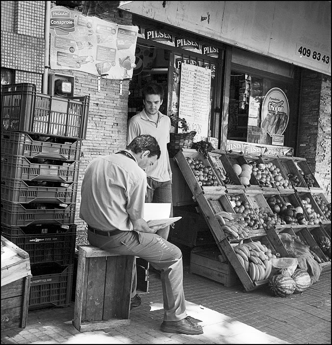
Pink, blue, green or orange, the colours of the shirts have no relevance here. Of course, no one would choose to live in a world without colour, but the b&w image provides an experience that a colour version cannot approach. It is unreal, in the sense that there is only a tenuous link to the reality we see with our eyes. Perhaps in some way the black and white photograph creates a more honest fiction, stripped of superficialities, encouraging us to focus on forms and the fundamental meaning of the image.
Reference
1 John Beardsworth (2007) "Advanced Digital Black & White Photography". ILEX.
Stephen Fell Photography: Stephen Fell
http://commons.wikimedia.org/wiki/File:Lascaux_painting.jpg
http://upload.wikimedia.org/wikipedia/commons/c/c9/Giotto_-_Scrovegni_-_-25-_-_Raising_of_Lazarus.jpg
http://upload.wikimedia.org/wikipedia/commons/3/30/Giotto_-_Scrovegni_-_-43-_-_Justice.jpg
First published 2011/02/01